

My single pages dashboard


When I first started using Home Assistant, I did what probably most people new to it do and created a dashboard with everything on it. After all, that’s the advantage of HA, it brings all of your smart home devices into a single place where you can monitor and control them. So of course you want everything in one place.
However, this creates a messy dashboard that is really only suitable for a large screen, it doesn’t work on a mobile phone. Moreover, it is hard to update when there’s a new device - for example, where do you put it and how does it affect everything else?
The options provided by the early Lovelace cards were relatively limited and clunky. However, recently there has been some significant improvements, especially through the mushroom cards.
I therefore decided to see if I could exploit these to create a better dashboard, one that would work on both mobile and laptop. This article describes my current dashboard and some of the underlying principles and approaches.
Basic principles
There were some basic principles I wanted my new dashboard to satisfy:
Page based with no vertical scrolling (especially on a mobile)
Clear presentation of information and controls with simple navigation between pages. Always know “where you are”.
Quick and clear feedback so you know an action has been accepted (ie avoid the situation where you tap something and you’re not sure if the tap worked)
Navigation and selection of actions should be as intuitive as possible.
Design decisions
I decided to split each page into two parts - a narrow top part showing some basic information and navigation buttons, with the remainder of the page containing the bulk of whatever the page was for. The narrow top part would use the mushroom chips card with the rest of the page using whatever was appropriate for the devices and functions. I’ve explained some of the cards I’ve used below.
I’d have a home page and then pages for each room/area (as that’s how we tend to use our smart home functions) although, as we’ll see, my media controls don’t quite follow this pattern. Every page, other than the home page, would have a home button and an indicator of what page you’re looking at.
For actions (other than those using specific entity cards), I’d use buttons and the button must go yellow as soon as it is successfully clicked (or tapped).
Home page
Below you can see my home page.
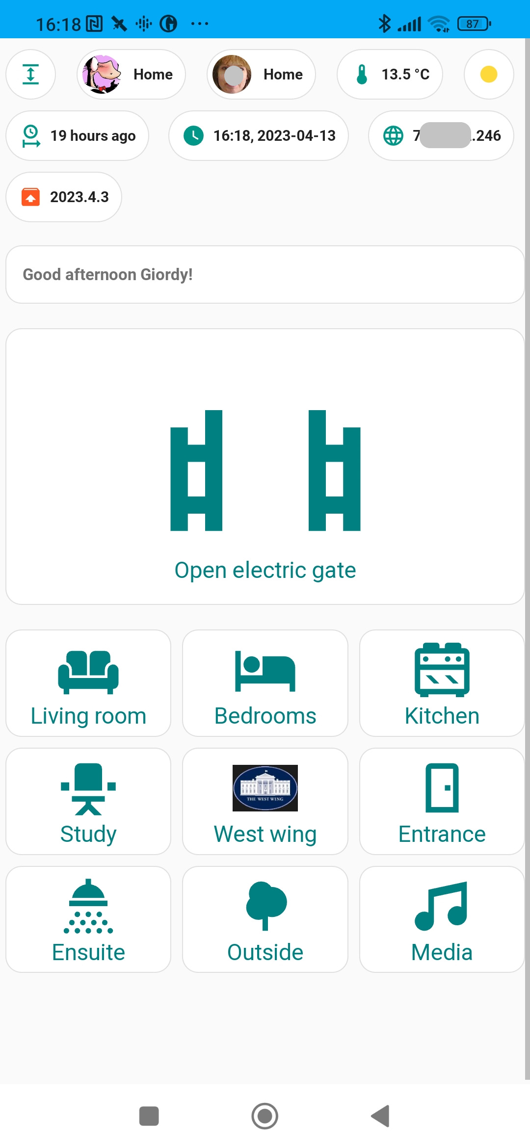
The chips at the top, from left to right and top to bottom, are for:
a button to toggle kiosk mode. I didn’t have this originally but it became almost instantly obvious I needed this as, without it, once in kiosk mode how do you get out?!
two buttons showing whether we’re at home or not
the current outside temperature
the current weather (in case I’m feeling too lazy to look out of the window)
how long since HA last restarted
the current date and time
my HA’s external IP address
a conditional chip that is only displayed if there’s a new HA version available
I use some of these for quick diagnostics of my HA system.
I then have a little welcome message followed by a big button to open our electric gate. This is on the home page and very big as it’s something we want to get to quickly if someone rings our bell.
And finally there are nine buttons that link to mainly room-based buttons. I’ve described a couple of these pages below as there are some common approaches I’ve used in them throughout.
The living room page
Below, you can see a gif illustrating my living room page. Note the narrow top row that is all but the same for all sub-pages. There’s the home and kiosk mode buttons (common to all sub-pages), and the armchair icon highlighted to show this is the living room page (different highlighted icons are used for each sub-page as appropriate).
By the way, when I recorded the gif I was making some mods to the setup so some devices showed up as unavailable.
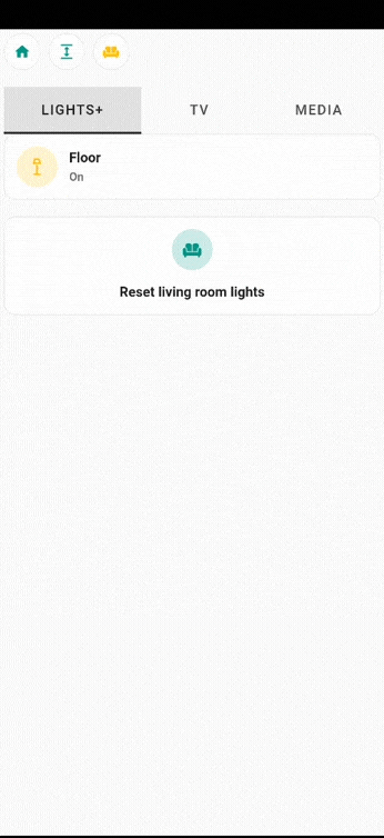
In my living room, there are several controllable devices (and I have plans for a few more). If I had these all visible at once, I would risk breaking one of my principles that there should be no vertical scrolling. So I have combined two custom card types to achieve the effect shown:
the custom:tabbed-card is the main container for the different device types, one tab for the lights, one for the TV switch and one for the Google mini. Each tab is titled and the “+” of the LIGHTS+ indicates that this tab has a swipe action too.
the custom:swipe-card is the first of the tabs. You can then swipe within that tab between each of the three lights in the room.
Finally, I have used a button to activate a scene so that all three lights are reset to their normal states as it’s all too easy to change one or more of them and returning to a normal scene by adjusting each manually can be hard!
I have used this approach in other rooms with the tabbed card where there are multiple device types and the swipe card where there is more than one device of a particular type (always marked with a “+” suffix to the tab title).
The media page
On my home page there’s a button for “Media”. This doesn’t go to a room or area-based page but allows control of any of three media devices as can be seen below (notice again my standard three chips at the top).

We have three devices we can control through HA - a pair of Sonos 3s (in a west facing room I’ve called the West Wing), a Sonos beam and a Google home. This page allows the selection of the device to control, which is then highlighted. Then the selected device can have its volume controlled, either by nudging it up or down or muting it, or directly raising or lowering it. I’ve also provided six buttons to enable a radio station to be chosen for the selected device. All of this can be seen in action in the gif above.
This page makes heavy use of HA helpers and Node Red flows, none of the devices are directly controlled. In essence, I have various Node Red flows that monitor the state of the helpers (toggles, numbers and dropdowns). If any of these change (through the buttons on the page), a flow is triggered that takes the appropriate action: raising/lowering volume, selecting device, etc and then resets the helper if appropriate. For example, when the volume up button is tapped, a helper input_boolean.media_vol_up is set true and a Node Red flow is triggered. This flow determines which device is currently selected, raises its volume and then resets the helper back to false so it can be tapped again to raise the volume.
Final thoughts
I’m very pleased with what I have achieved. Thanks especially to the mushroom cards, it has a very clean look and feel, with a simple intuitive navigation. I think any new user would quickly know how to get about the pages and understand what’s on them.
However, you might think I could have done things differently, improving on my approach. Please let me know in the comments below. I’d appreciate any feedback.